Introduction
For as long as I’ve started with machine learning, Jupyter Notebooks have been my most loyal sidekick. From data preprocessing to model training, fine-tuning, and testing, Jupyter Notebooks have been there at every step to support me. However, I always knew that there is an entire world beyond these digital pages — a world of deployment and application.
Taking the leap from training a model to actually deploying it might seem intimidating. However, it’s a critical step that transforms a data science project from a theoretical experiment into a practical, real-world application. And I knew I had to take that extra step!
In this article, we will embark on my journey of building a classification model for a Kaggle competition. We start from a typical EDA and pipeline building until reaching new-unexplored territory — at least for me — bringing my machine learning model to life, enabling it to interact and offer insights to users globally.
Let’s brace ourselves as we step outside the comfort of our Jupyter Notebooks, because we’re about to go on a deployment journey. Grab your coding cap, fasten your seatbelt, and let’s get ready for a thrilling ride into the world of machine learning deployment!
Playground Series Episode 5 Season 3: Ordinal Regression with a Tabular Wine Quality Dataset
Our journey starts with the fifth episode of Kaggle’s Playground Series’ third season. This series, promoted by Kaggle, presents a variety of machine learning challenges, inviting users to boost their skills in data analysis, feature engineering, data cleansing, and machine learning pipeline construction.
Episode five, Ordinal Regression with a Tabular Wine Quality Dataset, invited Kagglers to analyze a synthetically-generated dataset based on the Wine Quality Dataset. This dataset consisted of 12 attributes — including the target variable —which tell us more about each wine, like how acidic it is, its pH, the amount of chlorides, alcohol levels, and so on.
The evaluation metric for this competition is the Quadratic-Weighted Kappa, given by the following equation:

Where:
. Oᵢⱼ is the actual confusion matrix.
. Eᵢⱼ is the expected confusion matrix under randomness.
. Wᵢⱼ is the weighted matrix, which can be calculated as (i — j)², where i and j are the ratings.
A score equal to 1 suggests a perfect agreement between the raters, while a score equal to 0 indicates that the agreement is no better than what would be expected by chance.
The file submitted for evaluation had to be a .csv file consisting of columns ID and quality, where quality referred to the predictions of the final model for wines in the test dataset. Quality was a value, ranging from 3 to 8, where 8 implied the best quality and 3 implied the worst quality.
Exploratory Data Analysis
To enhance my exploratory analysis, I turned to Plotly — hands down, my go-to library for data visualization in Python. I kicked things off by taking a peek at some key descriptive statistics. Then, I dived straight into checking out the correlation heatmap.


The first insight I extracted from the descriptive statistics table was the difference in scales across the features. Something that we would deal with later on.
By analyzing the feature correlation map, I couldn’t help but notice that alcohol was the most positively correlated feature with the target variable quality. This can be confirmed by the following violin boxplot.

You can easily spot the trend in the image above. Starting from quality 5, we see a noticeable upward trend in the median value of the alcohol level. This pattern hints that wines with higher alcohol levels tend to also be of a higher quality. It’s a clue that this feature might be pretty good at predicting wine quality.
An inverse pattern can be spotted when analyzing the relationship between quality and volatile acidity. The higher the quality of wines, the lower the median value of volatile acidity.

And speaking of wine quality levels, it’s also helpful to check out how these qualities are distributed across the wines in our dataset.

Most wines scored 5 or 6, suggesting they fall in the ‘average’ category. Only a small portion of 12 wines received a low rating of 3, while 39 of them reached the ‘golden’ status with a score of 8. This kind of distribution of classes may introduce bias to our model, which makes it more susceptible to classifying wines as either 5 or 6, since that’s the range most wines fall into.
And since we’re talking about distribution, why not take a look at how all the other features are distributed across the data?

The histogram matrix above gives another valuable insight! Our features are not normally-distributed, meaning that their histograms do not resemble a bell curve. This information is relevant, because we could have better performances by transforming feature distributions into a Gaussian distribution — i.e., a normal distribution.
That sums up the key takeaways from our exploratory analysis for now. But don’t let the fun stop here! Be sure to check out these beautiful plots crafted with Plotly. For a deeper dive, click here to check my full notebook on Kaggle!
Preprocessing
Before we dive into the modeling phase, we need to tidy up our data! I kicked things off by crafting new features, aiming to boost the predictive power of our independent variables.
Remember when we dug into the correlations between features? These relationships can come in handy now that we are in the feature-creation stage. We can engineer new features from attributes that share a stronger correlation with the target variable — like alcohol, for instance.
These are the following features I’ve added to our training dataset:
- Total Acidity: Fixed Acidity + Volatile Acidity + Citric Acid;
- Acidity-to-pH ratio: Total Acidity ÷ pH;
- Free Sulfur Dioxide-to-Total Sulfur Dioxide ratio: Free Sulfur Dioxide ÷ Total Sulfur Dioxide;
- Alcohol-to-Acidity ratio: Alcohol ÷ Total Acidity;
- Residual Sugar-to-Citric Acid ratio: Residual Sugar ÷ Citric Acid;
- Total Acidity: Fixed Acidity + Volatile Acidity + Citric Acid;
- Alcohol-to-Density ratio: Alcohol ÷ Density;
- Total Alkalinity: pH + Alcohol;
- Total Minerals: Chlorides + Sulfates + Residual Sugar.
In addition to this, I used Scikit-learn’s QuantileTransformer. This helped me mold the distribution of our independent features into something closer to the Gaussian distribution. As a result, we got that tidy bell curve shape we were aiming for, which you can spot in the following histogram matrix.

Furthermore, I’ve used StandardScaler to tweak the mean and standard deviation values for each feature. Thanks to this tool, we have a mean (μ) of 0 and a standard deviation (σ) of 1, which you can see in the table below.

With all these data transformations completed, it was time to jump into feature selection, to identify the most impactful features for predicting wine quality. This is where RFECV, a handy tool from Scikit-learn, came into play.
RFECV stands for Recursive Feature Elimination with Cross-Validation. Recursive Feature Elimination is a technique that works by fitting an estimator and removing the weakest features — those with the smallest absolute coefficients —, and then repeating this process until all the least important features are eliminated. By using RFECV, we can have a set of features that bring genuine value to predictions, which in turn boosts accuracy and efficiency.
After running RFECV, we have a list of features that were selected as the most relevant ones for quality prediction.
The final step in our preprocessing session involved clustering. Here, I employed KMeans to bundle the data into distinct groups. These groups represent underlying patterns or relationships that may not be immediately apparent from, say, a Correlation Plot. It’s a clever way of unveiling and capitalizing on hidden structures within our dataset.
By analyzing an Elbow Curve Plot, it was decided that the optimal number of clusters was K = 3, which grouped the data into three different groups.

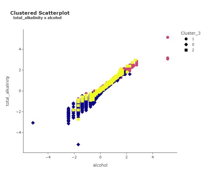
Furthermore, I created a scatterplot to illustrate the relationship between total alkalinity and alcohol, which provided more insight into the makeup of each cluster. For example, Cluster 0 comprises wines with lower levels of both alcohol and total alkalinity. On the other hand, Cluster 1 is dominated by wines leaning towards higher values for these same two features.
Modeling
We’ve finally made it to the modeling stage! We’ll start by using Scikit-learn’s Pipeline. This useful tool allows us to specify a series of functions and classes that will carry out all the preprocessing steps we’ve worked through earlier. This is done to ensure that each fold during cross-validation, as well as any data inputted into the app hosting our model, undergoes all the necessary preprocessing. It’s an easy and simple way to keep the process consistent.
We start by preparing all the steps that will then be performed in the pipeline.
After that, all we need to do is use sklearn’s pipeline class to create a list of tuples containing all the steps above.
This is what our pipeline looks like for now:

You can see how each preprocessing step follows a specific sequence. We start it off by creating and selecting the features, which are then transformed, scaled, and clustered. You might also notice that the final section, Model, is currently empty. This is where we are going to add our machine learning model to the pipeline.
I performed cross-validation on many models, fine-tuned them, and tried different ensemble methods such as VotingClassifier and StackingClassifier. To avoid having an overly-extensive article, let’s jump right into the final model used for this pipeline, but I reinforce that you can read the whole process here.
The best-performing model was the fine-tuned CatBoostClassifier with the following parameters:
After having decided on the best model and the best parameters, all we need to do is use Pipeline’s .set_params() and add our model to the last step of the pipeline.

We can also take a look at a Feature Importance plot, displaying the most relevant features in predicting quality during cross validation.
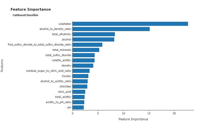
Sulphates earned the title of the most important feature during cross validation. It’s also worth noting that alcohol, and related features like the alcohol-to-density ratio and total alkalinity, were also significantly important for predicting quality. This aligns with the positive correlation we observed earlier between alcohol and wine quality.
After training and validating the model, I used Joblib to save my pipeline
After running the code above, my pipeline — wine_quality_prediction.pkl — was saved to the same folder I was running my notebook on. With this file, I am now able to load my pipeline on another notebook or environment to run my model on.
Building a Streamlit app on Hugging Face
Alright, now that we have a saved pipeline and a validated model ready to roll, we’re onto the next step— deployment!
I’ll be honest and say that I was a bit clueless about how to tackle this at the start. But after watching a few YouTube videos, I found out about Hugging Face Spaces, which allows us to easily build an app that can host our machine learning model.
If you don’t have an account, just click on the Sign Up button located at the top right of the screen, write in your email address, set a password, and you’re all set. This shouldn’t be difficult at all.

After signing up, you can go to Spaces, on the top menu, and click on Create new Space
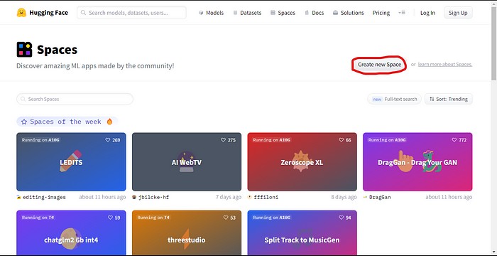
This takes us directly to another page, where we are able to give our Space a name, a license, a hardware, and a Space SDK. The SDK is what’s going to allow us for creating the interface of our app.

For this task, I have used Streamlit. According to its website, Streamlit allows for a faster way to build and share data web apps in minutes. All in pure Python, with no front‑end experience required. I’m not a specialist with Streamlit, but it was intuitive and pretty easy to create my first app with it. You can have access to its documentation by clicking here.
After creating a new space, you will be met with a page similar to the one below. You can use git to clone the repository or you can create the necessary files for running your app directly from your browser.

By clicking on Files, in the top menu, you’ll have access to the files in your repo. Initially, all you will have here is a .gitattributes file and a README.md file.

In my Wine Quality Prediction app, I first added the pipeline file, wine_quality_prediction.pkl. I then added a requirements.txt file, which simply contains a list of all the libraries necessary for running my app. You can see my Files page below.

The app.py file is a Python script where we load our pipeline and shape our app’s interface using Streamlit. Even though this was my first time using Streamlit, I found it relatively easy to make a simple interface to host my model. It’s not perfect, and there’s definitely more for me to learn about Streamlit, but I managed to get my model up and running just fine. And by the way, do not hesitate to use all these Large Language Models available online to lend a hand with the coding whenever you feel it’s necessary.
After having the app.py file all set up, you’ll be able to run your app with no further problems by clicking on the App option in the top menu.
If you wish to test my app, you can access it at Wine Quality Predictor Model. By clicking on this link, you’ll also be able to see the files I’ve uploaded to make this app run, including the coding behind the app.py script. Feel free to explore!
Also, if you want to check my Kaggle Notebook, where I’ve worked with the Wine Quality Dataset, performed some Exploratory Data Analysis with Plotly and used tons of machine learning libraries, such as Scikit-learn and Optuna, to train and tune my machine learning models, you can check it at Wine Quality: EDA, Prediction and Deploy. Feel free to leave feedback and an upvote, if you find this notebook useful!
Conclusion
We finally finish this journey from data preprocessing to deployment. This was, without a doubt, an enriching experience. It allowed me to explore a part of machine learning — and a bit of its real-world applications — in a way I hadn’t explored yet. The process of building a classification model for a Kaggle competition, and then deploying it for public access on Hugging Face, was both quite challenging and rewarding. I hope this article has provided valuable insights into the process and encourages others to take the leap from theory to practice. Remember, the world of machine learning is vast and full of opportunities for those willing to step outside their comfort zone.
If you have any questions or suggestions, please don’t hesitate to reach out.
Thank you so much for reading!


